Case Study: Self-Service Signup & Login Flow for AI Product Portal
Overview
Historically, the company relied entirely on sales-driven customer acquisition, which created friction for prospects and slowed adoption of our AI products. We needed a modern, streamlined way for potential customers to sign up, explore the platform, and activate an account, without talking to a sales rep.
I led the end-to-end UX effort and managed two designers to build a simple, fast, 60-second onboarding experience that reflected the emerging brand and lowered barriers to evaluating our AI offerings.
This project enabled the company’s first self-service growth channel.
Role
Team Lead
Individual Contributor
Timeline
2 Weeks
Product Type
Self-Service Portal for Evaluating Enterprise AI Products
Team
Myself (Lead Designer)
2 Junior Designers
1 Product Manager
1 Engineer
Key Stakeholders
Problem & Context
The Challenge
The company’s customer onboarding process required:
direct communication with a salesperson,
manual creation of accounts,
internal approvals, and
back-and-forth email exchanges.
This friction discouraged early evaluation, especially detrimental in a rapidly evolving AI market where competitors offered frictionless signups.
Primary Users
AI-curious business leaders (non-technical decision makers)
Technical practitioners evaluating feasibility (engineers, data analysts)
Pain Points Identified
No way to try the product independently
No simple login mechanism for returning users
Confusion about which product or path was right for their role
Overly technical explanations and poorly branded legacy UI
Constraints
Limited engineering bandwidth
Short timeline before a major product launch
Need to integrate with evolving design system + brand refresh
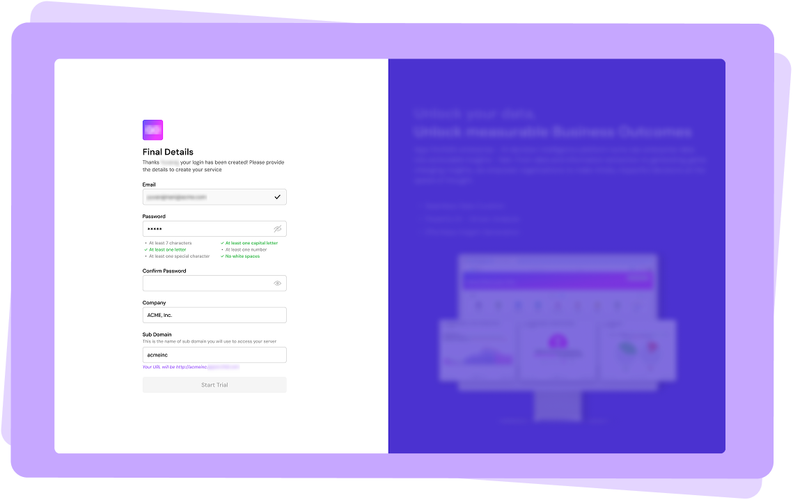
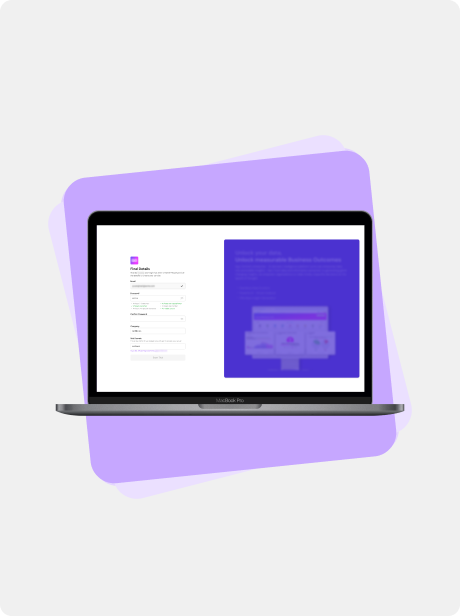
Sign-up screen showing standard fields plus product-specific required fields, with marketing material explaining the benefits of the product.
Defining the Experience
I led the UX direction around a core principle:
“Avoid complexity. The experience should feel effortless.”
In practice, this meant:
reducing steps,
eliminating jargon,
providing guardrails for different user types,
and designing a modern, branded entry point that set expectations for the entire product.
Key Experience Pillars
Instant clarity — Users immediately see what product they’re signing up for.
Short time-to-value — Signup completion in under 60 seconds.
Role-appropriate paths — Different needs for business vs technical users.
Trust & credibility — Clean visual language, clear security cues.
Seamless handoff — Smooth transition into the onboarding experience.
Design Activities & Process
My Responsibilities
Translated product requirements into UX strategy
Created end-to-end user flows + architecture
Designed wireframes and prototypes
Integrated design system components
Developed visual direction (color theme, typography, spacing)
Reviewed and guided junior designers
Collaborated with PM, engineering, and sales stakeholders
Ensured adherence to UX best practices for conversions
Key Concepts Explored
Two-path model: Business users vs technical users
Minimalist step-based flow: Email > verification > basic profile > done
Auto-detecting company domain based on email domain
Final Experience Components
Role Selection Screen
Helps users pick paths that match expectations (“Business Leader” or “Technical User”)Smart Email Input
Validates corporate domains, provides trust indicatorsBrand-Aligned Visual Design
Crisp typography, neutral colors with a signature accent, clean spacingMobile-Ready Layout
Optimized for phone-based signup (common scenario at conferences/demos)
A. Simple, Modern Signup Flow
A clean, single-column layout with fewer fields, clear labeling, and auto-validation.
B. Role-Specific Experiences
Business users see product value first
Technical users get quick access to documentation, API keys, and integration steps
C. Login for Returning Users
Simplified “Forgot Password” flow
D. Visual Direction
Fresh, neutral theme
Strategically placed accent color
Elevated whitespace and spacing rules
Consistent with the new design system
E. Error Handling & Edge States
Clear, friendly error messages
Blocked personal-email domains
Impact
Quantitative
Less than 60 seconds
Signup completion, down from multi-day sales process
Qualitative
“Game-changer for growth.”
-Leadership
Instant adoption
-across demos, webinars, and outbound campaigns
“This cut our qualification time sharply.”
-Sales
“I appreciate not having to go through sales.”
-Prospect
Strategic Impact
This project enabled:
A new self-service acquisition channel
Faster product evaluations (critical in AI competition)
Entry into product-led growth
Reduced dependency on sales for initial onboarding
A new foundation for future onboarding flows
It effectively modernized how the company presents itself to the outside world.
Lessons & Future Improvements
What I’d Improve
Add social SSO (Google, Microsoft)
Build analytics dashboards to track drop-offs