Case Study: Multi-Brand Design System for Enterprise Products
Overview
As the company expanded its suite of AI and enterprise tools, each product maintained its own separate design system, resulting in duplicated components, inconsistent styles, and recurring errors. Designers were spending too much time hunting, updating, and reconciling UI elements instead of designing.
I led the creation of a single, unified design system, one library, one set of tokens, one set of components that consolidated multiple product brands into a single toggleable system using Figma variables and variable modes.
This effort dramatically reduced design overhead, eliminated cross-product inconsistencies, and set the foundation for scalable, multi-brand product growth.
Role
Project Lead
Strategy
Direction
Vision
Individual Contributor
Timeline
6 months: intermittent, completed during downtime between product initiatives
Product Type
Unified Design System / Figma Library (Multi-brand, variables-driven, single-source-of-truth)
Team
Myself
3 Designers
Problem & Context
The Challenge
Each product had:
Its own separate design file
Its own icons, components, and patterns
Its own color and typography configurations
The impact was significant:
Duplicated effort maintaining components across multiple systems
Errors where designers unintentionally used elements from the wrong library
Inconsistency in UI patterns that made their way into production
Overhead from updating the same components in 3–4 places
The design team needed one library capable of powering all products, flexible enough for multi-brand use, but structured enough to enforce consistency.
Primary Users
Internal designers
Myself (daily user)
Constraints
The entire project was secondary to other product work
Progress could only be made during downtime
We needed to avoid disrupting ongoing design projects
Must integrate with existing partial design systems already in-flight
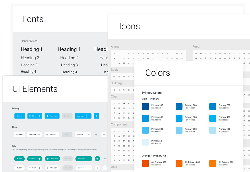
Research-driven selection of typography and color palette aligned with brand values.
I reviewed a range of design systems and branding references to define a color palette and typographic approach that expressed the brand’s professionalism and business focus.

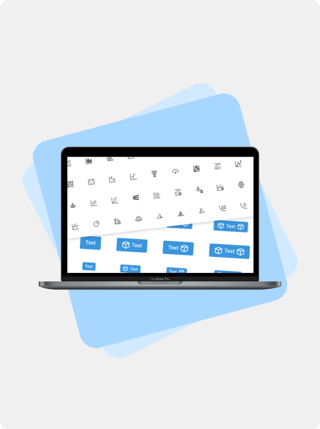
With a just a click, quickly change a dialog modal from one design system to another. Variable modes utilize color, string, numeric, and boolean variables.
Defining the Experience
I shaped the project around one guiding principle:
“One system. Multiple brands. Zero friction.”
My Leadership & Responsibilities
Defined the vision for a unified system
Established requirements & roadmap
Selected color systems, typographic rules, spacing grids
Defined the 3-tier token structure
Directed creative and technical work across 3 designers
Ensured consistency, scalability, and maintainability
Documented the approach and ensured adoption
Key Experience Pillars
Centralization: one place to manage all components
Flexibility: instantly switch brands with variable modes
Scalability: a token system that supports future products
Error reduction: fewer inconsistencies reaching engineering
Speed: faster, cleaner design workflows
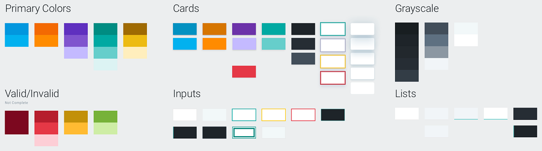
Functional colors
Each color is purposefully chosen to create visual harmony across components and contexts.
Buttons
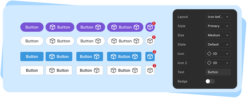
Buttons were one of the most challenging features of the multi-product design system with many options and brand-specific settings (color, corner radius, font, etc.).
Research & Design Activities
Foundational Research
I analyzed best practices across:
Figma’s Variables + Modes
Major design systems (Material, Fluent, Carbon etc.)
Token strategies
This led to the adoption of a 3-tier token structure:
Primitives: base color values, spacing, typography
Aliases: semantic names
Component tokens: applied at the component level
Design & Direction
Established the visual language across brands
Architected all tokens and variable modes
Directed designers in building flexible, unified components
Ensured the system reflected brand DNA while remaining cohesive
The Big Idea
Use tokens, variables, and modes to allow instant brand switching: no duplicated components, no redundant libraries.
Example
We maintained two distinct design systems: one for the customer-facing application and one for the internal engineering tools that configured it. With the new unified design system, designers could switch between libraries in the same file, allowing us to model how an engineer’s configuration directly shaped the end-user experience.
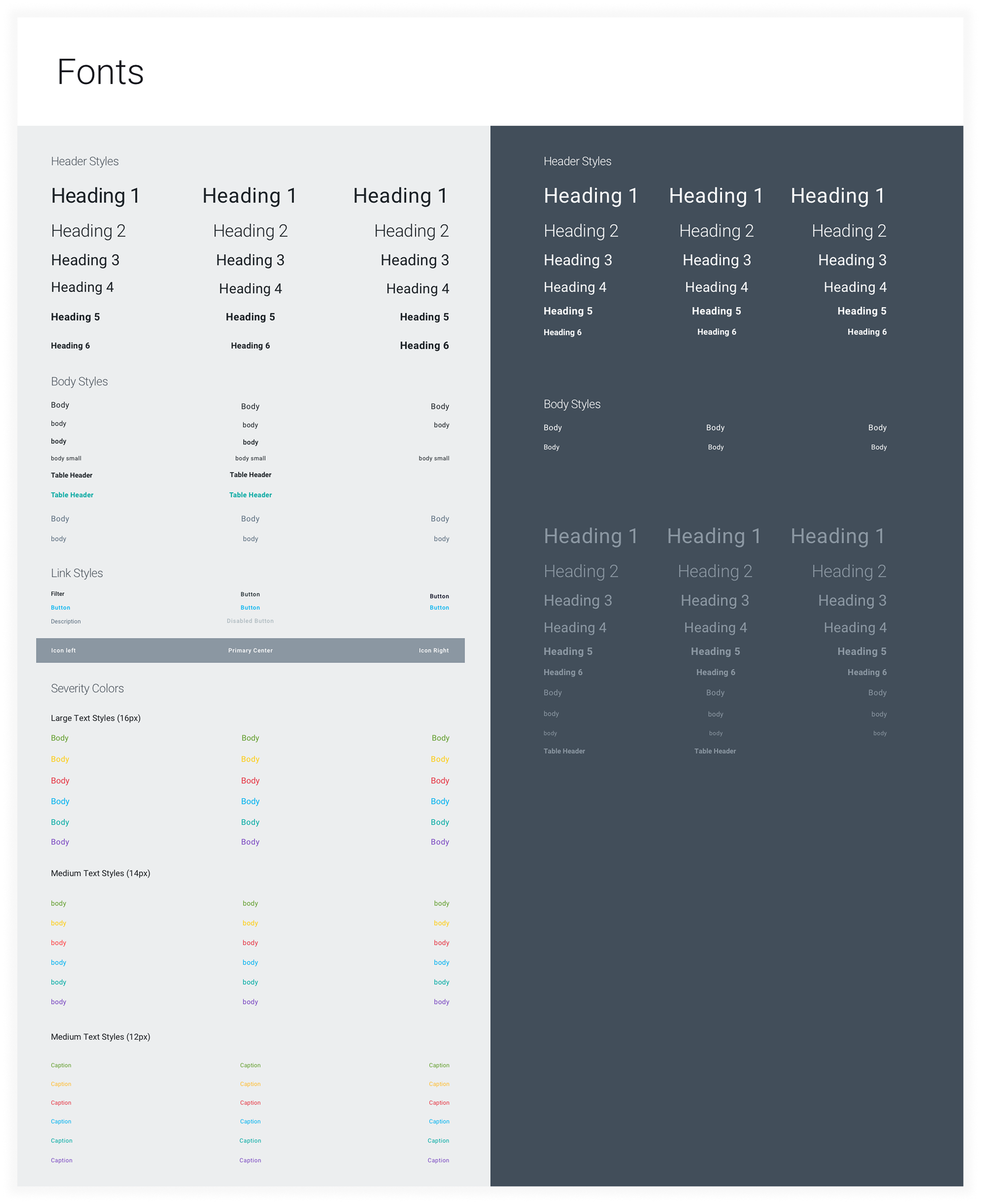
Typography
Typography establishes a clear hierarchy, supporting both readability and brand identity
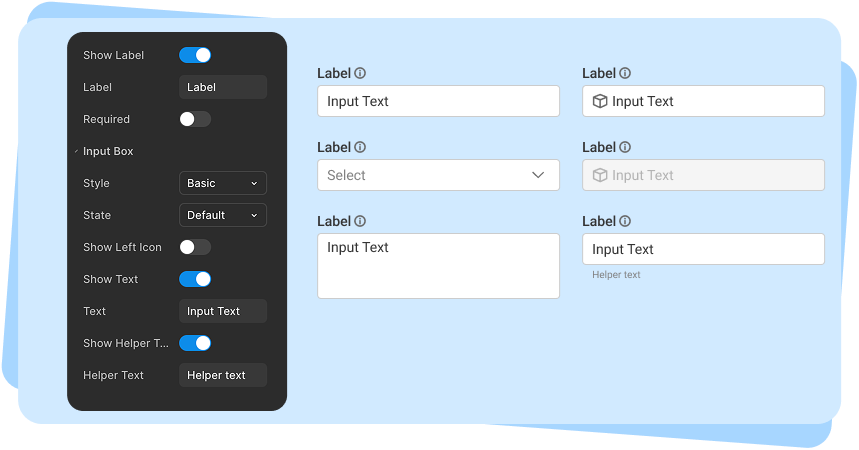
Inputs
The input design went through multiple rounds of usability testing, centered on a core question: should this be broken into multiple components, or handled as a single component with many toggleable features? We ultimately landed in the middle, balancing the number of components against the complexity and flexibility of each.
Final Design
A. One Library, Three Brands
All brands packaged into a single Figma library, each with:
Its own brand styling
Any brand-specific assets (logos, components, etc.)
B. Token-Driven UI
Colors, spacing, typography, radii, elevations -all tokenized
Changes cascade through every component
No designer ever edits raw values again
C. Component Uniformity
Buttons, inputs, nav, cards, modals, data visualizations
One component set, multiple visual expressions
Shared logic, consistent behavior
D. Instant Brand Switching
Using Figma modes:
A single toggle applies the entire design language
Zero duplication
Zero rework
Zero chance of mixing the wrong components
E. Scalability for Future Products
Adding a 4th or 5th brand becomes simply:
Adding a new mode
Assigning new token values
Zero refactoring
Impact
Quantitative
55%
Faster design cycles
Qualitative
“Night and day compared to before”
-Product Lead
85%
Fewer component errors
“So much easier, everything is just there.”
-UX Designer
75%
Less maintenance overhead
“A huge mental load off.”
-UX Designer
Strategic Value
This unified system enabled:
Faster multi-product development
Better cross-team alignment
Cleaner UX across the entire product ecosystem
A foundation for scaling new product lines
Less time spent maintaining, more time designing
Lessons & Future Improvements
If We Had More Time
Use Figma’s description field for all components
Add developer-facing documentation in Confluence
Create example pages/templates for common product screens
Add accessibility variants to component tokens