Case Study: Vibe Coding - Social Fight Scoring App
Overview
As a longtime UFC fan, I repeatedly experienced frustration watching fights where official judges’ scorecards felt disconnected from what was happening in the cage. This sparked a core question:
What if fans could score fights in real time and immediately see how others are scoring them?
I designed and built a mobile-first UFC fan app that allows users to:
Score fights round-by-round in real time
View live aggregate fan scores
Participate in fight-specific discussion
This was a self-initiated personal project, built entirely by me using vibe coding, to both design a compelling product and demonstrate my ability to learn an AI-assisted development workflow and ship an end-to-end experience independently.
Role
Product Designer
UX Strategist
Researcher
Vibe-Coder
Sole Builder
Timeline
1 week (part-time, iterative)
Product Type
Consumer mobile app
Live sports + social interaction
Team
Myself
Researcher
Problem & Context
The Challenge
MMA judging is subjective, and fan disagreement is part of the sport but there is no structured way for fans to:
Score fights as they happen
Compare opinions in real time
Separate round-by-round analysis from noisy social media commentary
Existing platforms (Twitter/X, Reddit, group chats) are:
Unstructured
Post-hoc
Emotion-driven rather than round-driven
At the same time, I wanted to explore vibe coding as a way to rapidly translate UX intent into working software without a traditional engineering workflow.
Primary Users
Internal designers
Myself (daily user)
Constraints
The entire project was secondary to other product work
Progress could only be made during downtime
We needed to avoid disrupting ongoing design projects
Must integrate with existing partial design systems already in-flight

With a just a click, quickly change a dialog modal from one design system to another. Variable modes utilize color, string, numeric, and boolean variables.
Defining the Experience
I anchored the experience around a simple principle:
“Fast opinions, not perfect analysis.”
In practice, this meant:
One-tap round scoring
Clear separation between scoring and discussion
Structured interaction that mirrors real judging
Key Experience Pillars
Real-time first: Designed for live viewing, not post-fight analysis
Low cognitive load: Simple actions during high-intensity moments
Collective insight: Aggregate fan sentiment over individual hot takes
Social, not toxic: Conversation without ranking or downvoting users
Buildable via vibe coding: UX decisions that could be realistically implemented solo
Buttons were one of the most challenging features of the multi-product design system with many options and brand-specific settings (color, corner radius, font, etc.).
Research
Before designing or building, I validated the core assumption through informal qualitative research with other UFC fans.
Research Activities
One-on-one conversations with frequent UFC viewers
Group discussions during live events
Comparison of personal scorecards vs. official judging
Key Insight
Across multiple conversations, fans consistently expressed the same pain point:
“The judges often get the scoring wrong.”
This confirmed that:
The frustration was shared, not personal
Fans already score fights mentally
There was appetite for a shared scoring experience
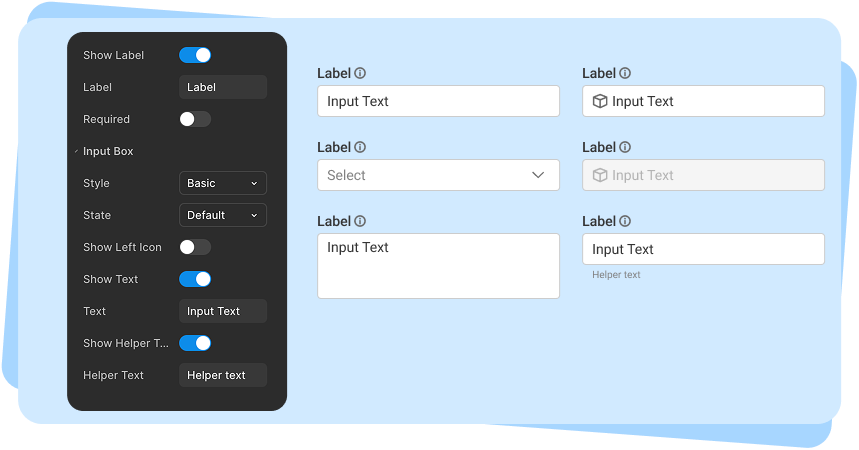
The input design went through multiple rounds of usability testing, centered on a core question: should this be broken into multiple components, or handled as a single component with many toggleable features? We ultimately landed in the middle, balancing the number of components against the complexity and flexibility of each.
Design Activities & Process
My Responsibilities
Defined product concept and scope
Conducted user research with UFC fans
Wrote full user stories using agile methodology
Created end-to-end user flows
Designed UI and interaction patterns
Learned and applied vibe coding principles
Built the working application myself
Iterated between design intent and implementation constraints
Impact
Qualitative
“Night and day compared to before”
-Product Lead
“So much easier, everything is just there.”
-UX Designer
“A huge mental load off.”
-UX Designer
Lessons & Future Improvements
If We Had More Time
Use Figma’s description field for all components
Add developer-facing documentation in Confluence
Create example pages/templates for common product screens
Add accessibility variants to component tokens
Other Case Studies
Data Pipeline Builder
Sign-Up Flow