Case Study: AI Insight Discovery Platform for Business Users
Overview
The goal of this project is not simply to surface analytics. It is to transform complex data into clear, meaningful insights that anyone in the business can understand immediately.
Most analytics tools are built for specialists who know how to interpret charts, metrics, and dashboards. This system takes a different approach: it uses AI to identify what actually matters in the data and present it as concise, story-driven insights designed for business users, not data analysts.
Each insight highlights an important change, pattern, or emerging signal and explains it in plain language. Visual summaries provide instant context, while the Full Story experience allows users to explore deeper when needed—revealing supporting data, related insights, conversations around the insight, and the AI’s reasoning behind why the insight was generated.
By combining AI interpretation with human-readable storytelling, the system helps organizations move from data exploration to immediate understanding.
Success is measured not by how much data is shown, but by how quickly people across the business can recognize what matters and decide what to do next.
Product Type
AI Insight Discovery Platform: AI-generated insights surfaced through narrative insight cards
Role
Lead UX Designer
Timeline
6 Months
Team
Myself
VP Product Design
VP Engineering
Engineering Team
Product Management
Problem & Context
The Challenge
Organizations generate enormous amounts of data across systems, products, and operations. While analytics tools provide dashboards and charts to explore this data, understanding what the data actually means often requires specialized analytical skills. As a result, many insights remain buried in dashboards that only trained analysts know how to interpret.
At the same time, many business leaders and operational teams are responsible for making decisions based on that data. They understand their business deeply and recognize when something important is happening, but they often lack tools that translate complex analytics into clear, meaningful explanations.
This gap creates several challenges:
Business users must rely heavily on analysts to interpret dashboards and surface insights
Important patterns and changes in data can go unnoticed or take too long to identify
Decision-makers spend time searching for answers rather than understanding what the data is already signaling
Traditional analytics platforms focus on data exploration, assuming the user will find insights themselves. But for many organizations, what is needed instead is insight discovery—a system that proactively identifies what matters and explains it clearly.
The goal of this project was to design a system that automatically surfaces important insights from data and presents them in a way that business users can understand at a glance, while still allowing deeper exploration for those who want to investigate the story behind the insight.
Primary Users
Business Leaders: Users responsible for making strategic or operational decisions who need to quickly understand what is happening in their organization without analyzing complex dashboards.
Business Analysts: Users who regularly work with data and metrics but benefit from AI-generated insights that surface important patterns, trends, and anomalies automatically.
Operational Managers: Users focused on day-to-day performance who rely on clear signals and explanations to identify emerging issues, performance changes, or opportunities for improvement.
Data-Curious Professionals: Users across the organization who want to understand what the data is saying but may not have the technical background to interpret raw analytics or advanced visualizations.
Defining the Experience
The design approach was guided by a simple principle:
Make complex insights immediately understandable.
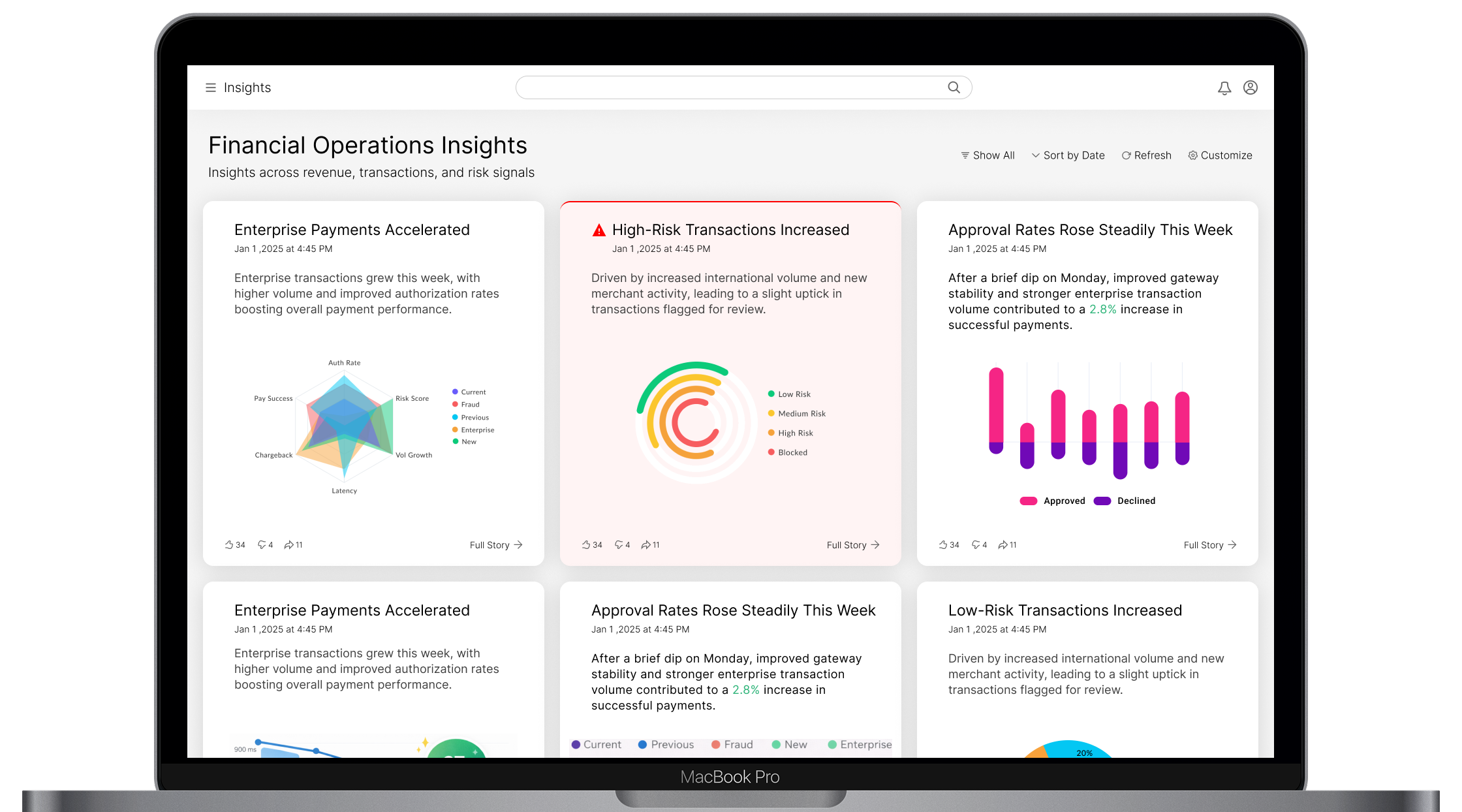
Rather than presenting users with dense dashboards or raw analytics, the system surfaces AI-generated insights as clear, narrative signals that can be understood at a glance.
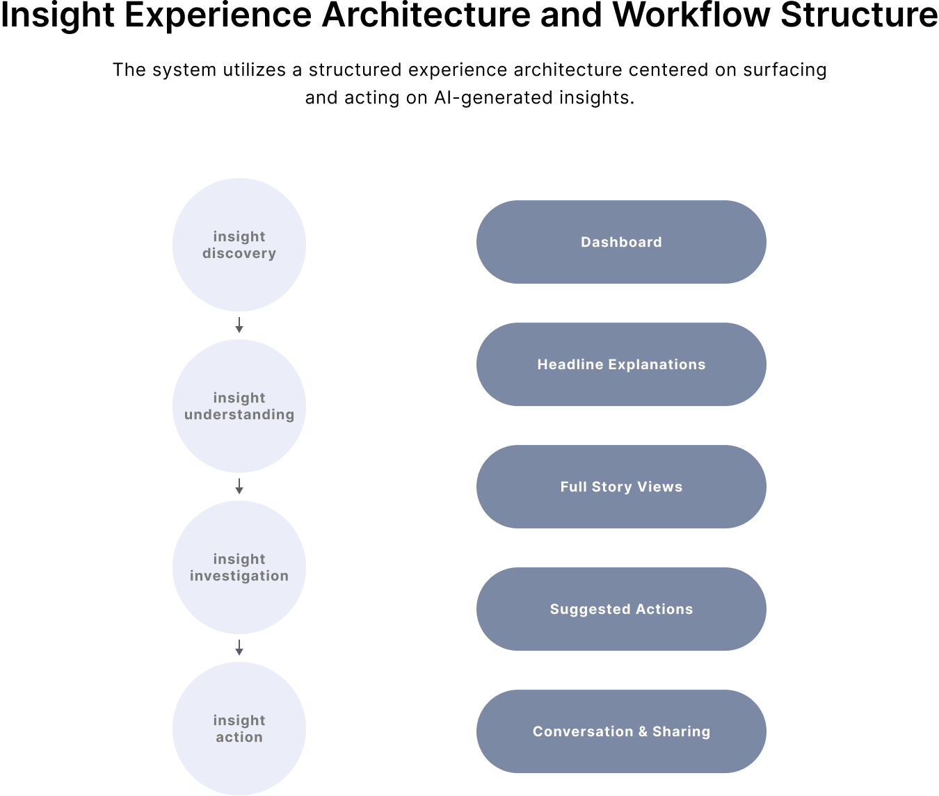
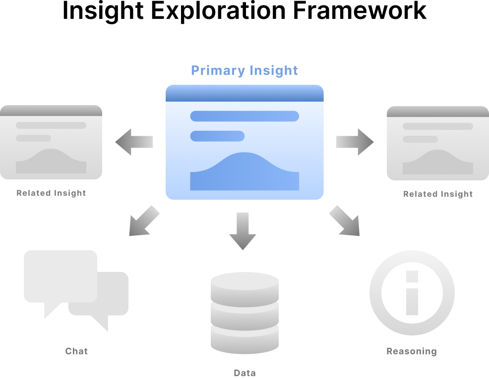
Each insight acts as an entry point into a deeper understanding of what is happening in the data. The experience is structured so users can explore insights in complementary ways:
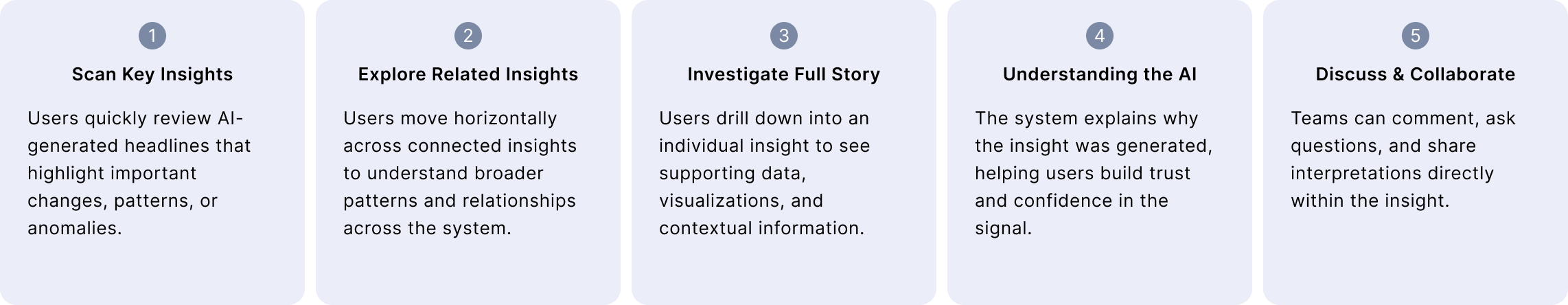
Structuring the experience around concise insights with clear exploration paths helps reduce cognitive overload and enables business users to move from awareness to understanding without needing deep analytical expertise.
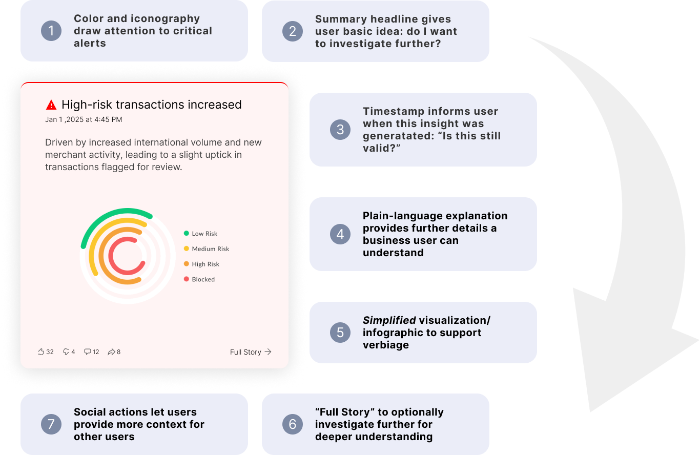
Anatomy of an Insight Card
I designed the layout to help business users move from awareness to understanding in seconds. Each element of the card progressively adds context without overwhelming the user.
Visual cues and color immediately draw attention to important signals, while a concise headline communicates the core insight at a glance. A timestamp establishes relevance, and a plain-language explanation provides additional clarity without requiring technical expertise. A simplified visualization reinforces the message visually, making patterns easier to grasp. If users want to learn more, the “Full Story” pathway allows them to drill into supporting data, related visualizations and insights, AI reasoning (for trust), and discussion.
Together, these elements create a layered experience that gradually increases comprehension while allowing users to engage only as deeply as they need.
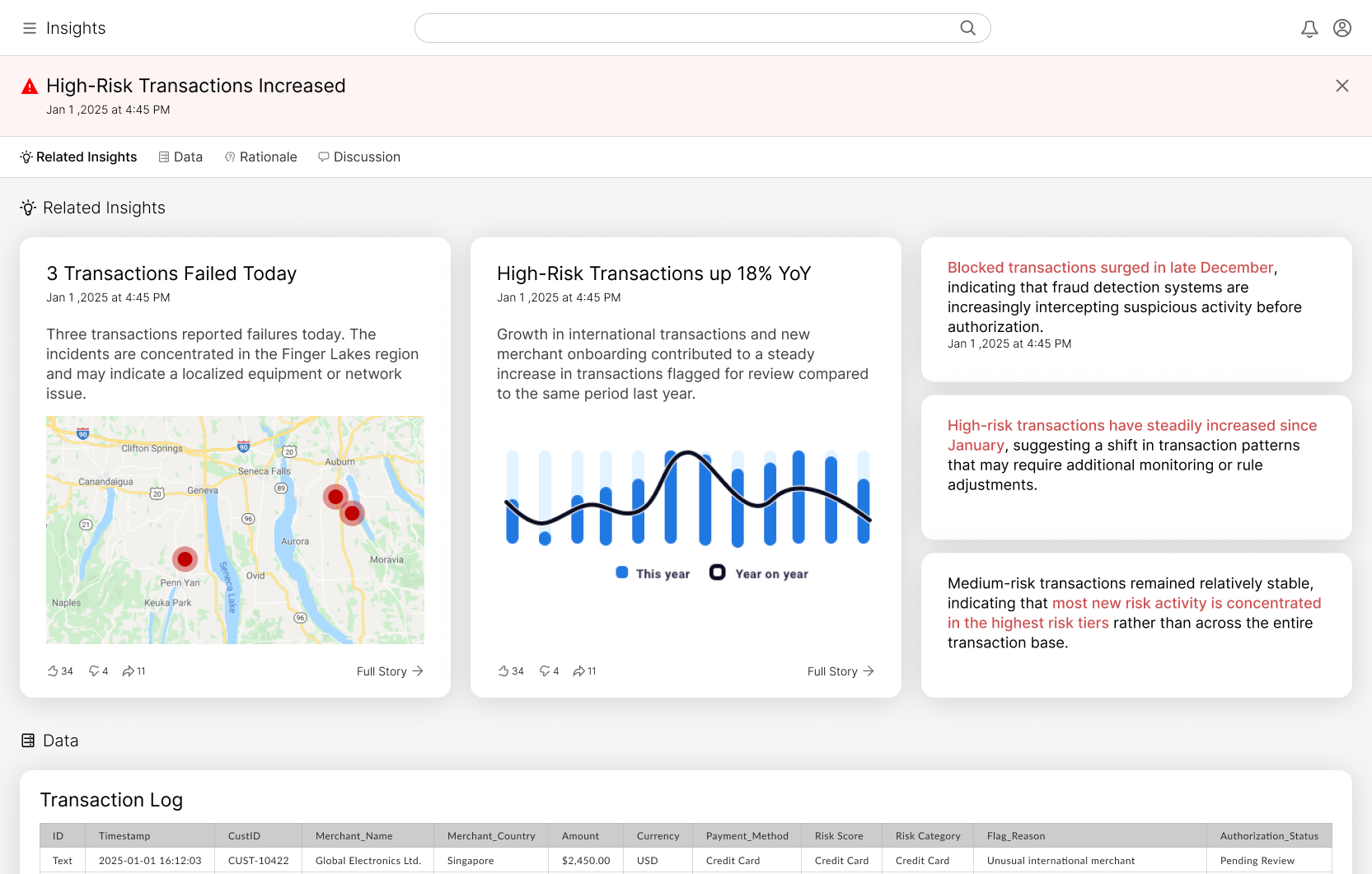
Full Story
The “Full Story” view expands a single insight into a structured explanation that helps users move from a quick signal to deeper understanding. Rather than forcing users to interpret complex dashboards, the interface organizes supporting context into clear layers that can be explored as needed.
At the top, the primary insight summarizes the key finding and why it matters. From there, users can explore related insights that provide additional signals connected to the same trend or event. These complementary insights help users see whether the issue is isolated or part of a broader pattern.
Supporting visualizations and examples make the insight easier to interpret by showing the data behind the signal. Users can quickly understand trends, geographic patterns, or operational impacts without needing to analyze raw data themselves.
For users who want to investigate further, the interface provides access to the underlying data and the AI-generated rationale behind the insight. This allows users to understand how the system arrived at the conclusion, examine supporting records or metrics, and validate the signal if needed. By exposing both the evidence and the reasoning, the system builds transparency and trust in the insight.
Together, these layers create a guided pathway from AI-generated signal to supporting evidence to deeper investigation, enabling business users to quickly understand what is happening and decide whether action is required.